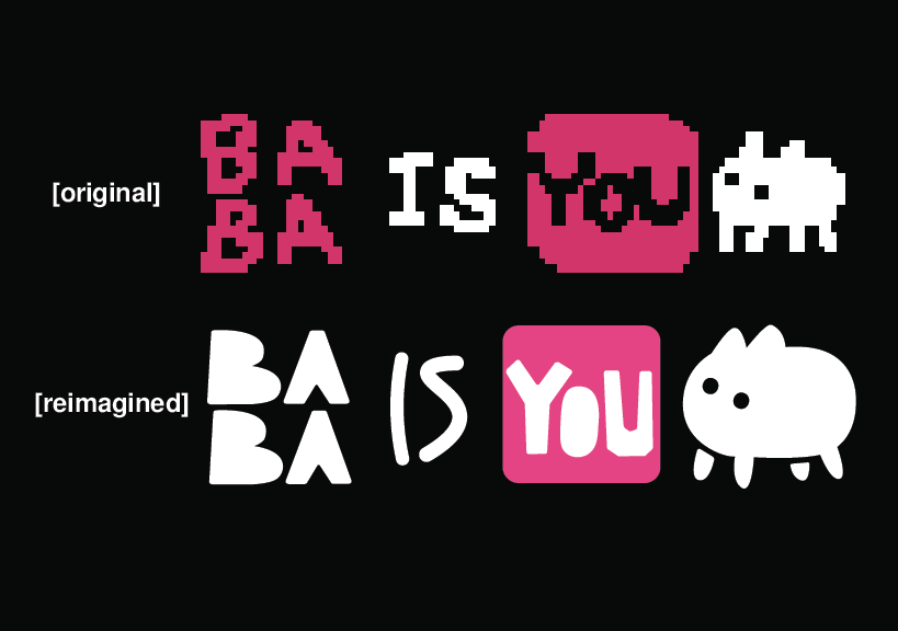
BABA Co. is a fictional brand I created as a branding exercise inspired by the charming pixelated character BABA from the video game BABA IS YOU. The goal was to transform the character into the centerpiece of a marketable brand, reimagining its original pixel graphics into a smooth, modern vector logo and establishing a cohesive brand identity. This project allowed me to apply my design skills to explore what makes a brand visually appealing and memorable.
6 weeks
Logo Design
Brand Identity
Adaptability
Adobe Illustrator
Graphic Designer

Design Process
BABA’s charm lies in its simplicity and cuteness. I wanted to preserve these qualities while adapting them to a professional brand context. This required balancing playfulness with sophistication to appeal to a wider audience.
Brand Identity
A strong brand identity goes beyond just the logo. I carefully considered how BABA Co. might visually present itself to its audience.
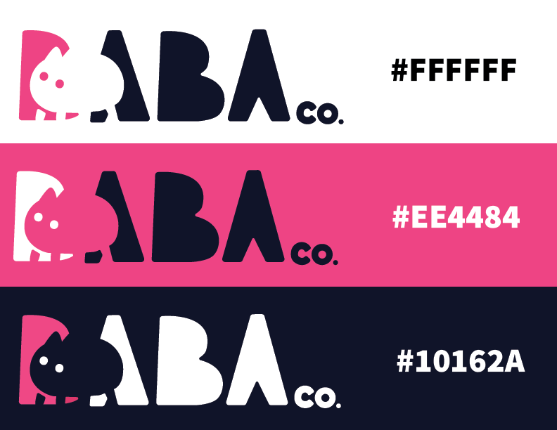
White to highlight clarity and simplicity
Pink for a touch of playfulness and charm. Pink is also a primary color for BABA in game, a callback to it’s origins
Navy to convey professionalism
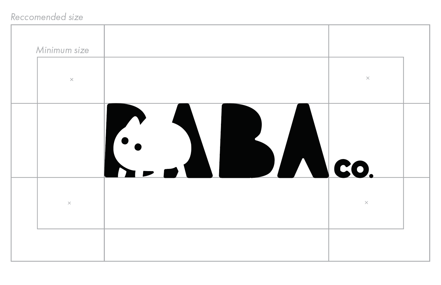
One of the primary challenges was ensuring that the logo and brand identity appealed to both existing fans of BABA IS YOU and a broader audience unfamiliar with the character. I considered the fundamentals of effective logo design: simplicity, versatility, and memorability. The BABA Co. logo was designed to be:
Clean and easily recognizable, even at small sizes.
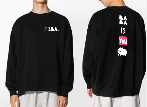
Adaptable for use on a variety of media, from digital platforms to print materials.
Retaining the unique and lovable essence of BABA, ensuring it stands out in the minds of viewers.
Brand Flexibility
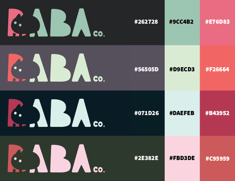
In addition to the primary navy, white, and pink palette, I developed several alternative palettes to ensure the BABA Co. brand could adapt to a variety of themes and applications. These options enable BABA Co. to seamlessly align with seasonal campaigns, special events, or targeted marketing efforts without losing its core identity. This flexibility enhances the brand’s relevance and appeal across diverse contexts.
Conclusion
This project was a rewarding exercise in transforming a beloved character into the foundation of a marketable brand. Combining creative reinterpretation with solid design principles gave me the chance to demonstrate how thoughtful branding can enhance a character’s appeal and establish a strong visual identity. BABA Co. exemplifies how design can bridge the gap between nostalgia and marketability.